If you’ve ever opened the WordPress theme library, scrolled past the 200th option, and quietly closed the browser tab — you’re not alone. WordPress website design feels overwhelming because it genuinely is overwhelming without a framework to guide you. The official WordPress.org directory alone offers over 13,000 free themes, and the total number of WordPress themes, including premium marketplaces, exceeds 30,000. That’s before you’ve even looked at page builders, custom developers, or the dozen plugins each one needs.
Here’s the honest truth most guides skip: the confusion usually isn’t about complexity. It’s about not knowing which problem you’re actually solving. Are you trying to launch fast? Look credible? Save money? Stay self-sufficient? Each answer points to a completely different design path — and this guide will help you find yours.
Why WordPress Website Design Feels So Overwhelming (And How to Fix That)
The overwhelm is real, and it’s not a personal failing. The sheer scope of the WordPress ecosystem is genuinely staggering. WordPress powers a whopping 43.1% of the internet — which means the platform has to serve everyone from a teenager launching a hobby blog to an enterprise running a multi-million-dollar ecommerce operation. Every tool, theme, and page builder you see is trying to serve all of them at once.
The second layer of overwhelm: most design guides are written by developers or affiliate marketers, not by people who remember what it felt like to be a confused beginner. They assume you already know the difference between a theme and a page builder, or that you have a clear brand identity ready to go. You probably don’t — and that’s completely fine.
The fix isn’t finding the “perfect” tool. It’s answering three questions before you touch a single setting:
- What does “done” actually look like for me? (A 5-page business site? A blog? An online store?)
- What’s my real constraint — time, money, or skills? (Most people have two of the three. Few have all three.)
- How much do I want to learn vs. just launch? (There’s no wrong answer here.)
Once you’ve answered those, the design tool almost picks itself. The sections below walk you through exactly how.
The Three Paths to WordPress Design: Which One Matches Your Reality?
There are essentially three routes to a designed WordPress website. Each has a different cost ceiling, time investment, and skill requirement. None of them is objectively “best” — the right one depends entirely on your situation.
| Approach | Typical Cost | Time to Launch | Skill Required | Best For | Key Trade-off |
|---|---|---|---|---|---|
| DIY with a Pre-Built Theme | $0–$100 (theme) + hosting | 1–3 days | Minimal — point and click | Bloggers, early-stage solopreneurs, tight budgets | Limited flexibility; may look similar to thousands of other sites |
| Page Builder (e.g., Elementor, Divi, Gutenberg) | $59–$399/year for pro tools | 1–2 weeks | Moderate — drag-and-drop with a learning curve | Small business owners who want control without coding | More design power, but can add code bloat that slows your site |
| Hired Developer / Custom Design | $2,000–$15,000+ | 4–10 weeks | None required from you | Established businesses, high-conversion needs, unique brand | Higher upfront cost, but often the lowest total cost of ownership over time |
A critical gotcha to watch for: these paths aren’t mutually exclusive. Many of the most effective WordPress sites use a hybrid approach — a lightweight, performance-focused theme paired with WordPress’s native block editor (Gutenberg). At development firms that work in WordPress, a hybrid approach using a custom theme with Gutenberg blocks for content editing is increasingly common. WordPress’s native block editor has matured significantly and can provide a good editing experience when properly configured with custom blocks and patterns tailored to your design system.
Decision Framework: Matching Your Budget, Skills, and Timeline to the Right Approach

Stop trying to find the “best” WordPress design tool. Start by identifying your biggest constraint. The answer will steer you to the right path faster than any comparison article.
If Your Biggest Constraint Is Budget
Start with a free, lightweight theme from the WordPress.org directory — Astra, GeneratePress, Kadence, and Neve are consistently praised for their performance and clean code. Pair it with WordPress’s native Gutenberg block editor, which is free and already installed. This combination costs you nothing beyond hosting and gives you a surprisingly capable design foundation. With a WordPress theme, it is possible to make your website operative with a single day’s effort, and choosing WordPress themes is the best decision for cost-effective building, as it offers a ton of free features.
If Your Biggest Constraint Is Time
A page builder like Elementor or Divi with a pre-built starter template is your fastest route to a professional-looking site. A small business owner can build a professional-looking site in a weekend using these tools. The honest trade-off: page builder sites often become harder to maintain over time. Plugin updates can break layouts, and switching page builders means essentially rebuilding from scratch. Speed to launch is real — but factor in the long-term maintenance time before committing.
If Your Biggest Constraint Is Skills (or Confidence)
This is the most common constraint, and it’s the most underserved by generic WordPress guides. If you’re not confident with technology, the answer isn’t to push through a page builder’s steep learning curve. Start with one of the simpler block-based themes and the native Gutenberg editor. The goal is to get something live — a “good enough” site that you can actually maintain and improve over time. Perfect is the enemy of published.
If Your Business Depends on Your Website for Revenue
This changes the calculation significantly. For businesses that rely on their website for leads or sales, a custom theme typically delivers better results. A custom WordPress theme from a specialist or agency typically costs between $2,000 and $10,000+ depending on the number of pages, content fields, and integrations required. That feels steep — but compare it against the five-year total cost of ownership for a DIY page builder site, which can add up to $5,000–$10,000+ once you factor in plugin costs, developer workarounds, performance optimization attempts, and an eventual rebuild when you outgrow it.
If you’re unsure which path fits your specific situation, the team at WordPress AI Tools offers personalized guidance — not a generic quiz, but a real conversation about your goals. Reach out when you’re ready.
The Honest Trade-Offs: Themes vs. Page Builders vs. Custom Design
Every design approach comes with genuine advantages and real downsides. Here’s what most guides won’t tell you about each one — with the trade-offs surfaced upfront instead of buried at the end.
Pre-Built Themes: Fast, Affordable, and Limited by Design
Pre-built themes are the fastest path from “nothing” to “live website.” They’re well-suited for blogs, portfolios, and simple service sites. The limitation isn’t quality — top free themes like Astra are genuinely well-coded. The limitation is differentiation. You might end up choosing themes similar to others for your website. If your brand identity depends on a distinctive visual presence, a pre-built theme will feel like a constraint within months.
There’s also a hidden risk worth knowing: since you don’t own the design and code, any errors on the theme developer’s end can mess up your site. Always have backups and a maintenance plan before going live on any theme.
Page Builders: Visual Power with Real Performance Costs
Page builders like Elementor and Divi are genuinely useful tools that have democratized web design. Page builders have democratized web design in a way that few tools have matched. The drag-and-drop interface is intuitive once you learn it, and the template libraries are impressive.
But the performance trade-off is real and documented. Page builders add 200KB–500KB+ of extra CSS/JS, which impacts Core Web Vitals and search rankings. And a typical page builder site loads 15–30+ additional CSS and JavaScript files per page. This matters because research has shown that a 1-second delay in page load time can result in an approximately 4.5% reduction in your conversion rate.
There’s also a lock-in issue most beginners don’t anticipate. You’re locked in. Try switching from Elementor to Divi, or to anything else — your content is stored in page builder shortcodes and proprietary formats. Migration means rebuilding every page from scratch. Go in with eyes open.
Custom Design: The Highest Upfront Cost, Often the Best Long-Term ROI
A professionally built custom WordPress site is purpose-built for your business. A custom theme costs more upfront, but the total cost of ownership is often lower when you factor in performance, security, and maintenance. You also get full design freedom — no template constraints, no builder dependencies, no vendor lock-in.
The honest trade-off: a professionally developed custom WordPress theme typically runs between $3,000 and $15,000+, depending on complexity. It takes weeks or even months to design, develop, and test. You’ll need an experienced developer — this isn’t a DIY job.
That’s a meaningful investment for a solopreneur just starting out. For an established business that relies on its website for leads, it’s often the most rational financial decision when viewed across a 3–5 year horizon.
Phase 1: Planning Your Design (Before You Touch WordPress)
Most people get this backwards. They install WordPress, browse themes, pick one that looks nice, and then try to figure out what their site is actually supposed to do. The result is a site that looks like a website but doesn’t accomplish anything specific.
Before you open the WordPress dashboard, nail down these four things.
1. Define Your One Primary Goal
Every page on your site should support one primary business goal. Not five goals — one. Is it “book a discovery call”? “Subscribe to my newsletter”? “Buy this product”? Every design decision — color choices, button placement, page structure, even fonts — flows downstream from this single answer.
2. Map Your Core Pages Before Designing Them
Most small business websites need only five to six pages to accomplish their goals: Home, About, Services (or Products), Blog (optional), Contact, and sometimes a Portfolio or Testimonials page. Resist the urge to add pages because competitors have them. Start lean and add only when there’s a clear user need.
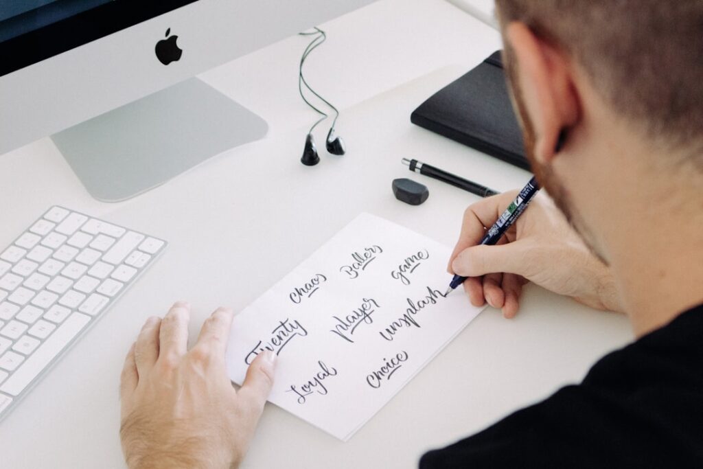
3. Gather Your Brand Assets (Even Basic Ones)
You need at minimum: a logo (even a simple text-based one), a defined color palette (two to three colors max), and one or two font choices. Free tools like Canva or Adobe Color can help you build a basic brand kit in an afternoon. Without these, you’ll make design decisions by feel — and the result almost always looks inconsistent.
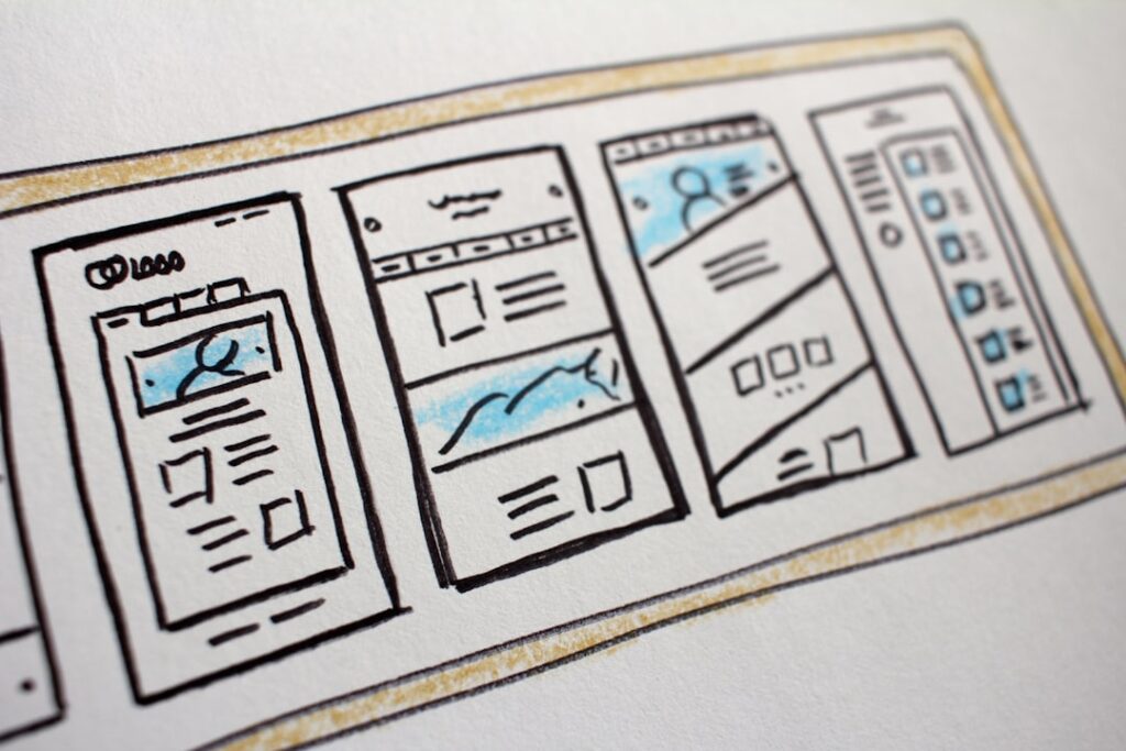
4. Collect Competitor and Inspiration Examples
Find three to five websites in your industry you genuinely admire and save screenshots of them. Don’t copy them — use them to articulate what you don’t want your site to look like. This clarity is invaluable when you’re choosing a theme or briefing a designer. The goal is to use visual examples as a shortcut for communicating design intent.
Phase 2: Choosing Your Design Tools (Themes, Builders, or Hybrid)
With your planning done, choosing tools becomes far simpler. You’re no longer picking the “best” tool — you’re picking the right tool for your specific situation. Here’s how to move through the decision without analysis paralysis.
Choosing a Theme: What to Actually Look For
Ignore star ratings and “most popular” lists when evaluating themes. Focus instead on four things: load speed (check if the demo scores well in Google PageSpeed Insights), active installs, frequency of updates, and quality of support documentation. Astra, Divi, and Avada are the most used WordPress themes — but “most used” doesn’t always mean “best for your situation.” Lightweight themes like GeneratePress or Kadence often outperform the heavyweights in real-world performance tests.
Choosing a Page Builder: The Questions That Actually Matter
Elementor and Yoast are the most used plugins for WordPress, with 10 million active installations for Elementor alone. But popularity aside, the questions to ask before committing to any page builder are:
- Can I afford the renewal rate long-term? (Always check the renewal rate before committing — introductory pricing often differs significantly from year two.)
- Will my team or VA be able to edit pages without my help?
- What happens to my content if I stop paying the subscription?
- Does this builder have a track record of long-term support and active development?
The Mobile-First Non-Negotiable
Whatever tool you choose, your design must be built mobile-first — not “mobile-compatible.” With over 60% of all web traffic originating from mobile devices, a website that isn’t designed for a seamless mobile experience is actively turning away the majority of its potential audience. In 2025, mobile-friendly design is no longer a feature; it is the core of a successful digital strategy. Google’s mobile-first indexing also means the mobile version of your site is the baseline for how it understands and ranks your content. A poor mobile experience doesn’t just frustrate users — it directly harms your visibility in search results.
Phase 3: Building Your Core Pages Without Decision Paralysis
This is where most beginners stall out. You’ve picked a theme, you’ve installed WordPress — and now you’re staring at a blank page wondering if your headline is good enough, if the colors are right, if the layout is the one. Here’s the framework that breaks the paralysis.
The “One Job” Rule for Every Page
Every page has exactly one job. Your homepage’s job is to answer “am I in the right place?” in 5 seconds. Your About page’s job is to build trust. Your Services page’s job is to help the visitor decide if what you offer matches what they need. Your Contact page’s job is to eliminate friction from reaching you. When you’re paralyzed by a design decision, ask: “Does this choice help the page do its one job?” If the answer is no, remove it.
Homepage: The 5-Second Test
Users form an opinion about a website in just 0.05 seconds. This means you have less than a second to make a positive first impression. Your homepage needs to communicate three things above the fold (before scrolling): who you are, what you do, and who you do it for. A clear headline, a one-sentence subheadline, and a single call-to-action button. That’s the minimum viable homepage.
The fear that drives most bad homepage designs: “What if it looks cheap?” Here’s the honest answer: research has shown that first impressions of a website are 94% design-related. But “design-related” doesn’t mean expensive. It means intentional. A clean, simple homepage with good typography and consistent spacing looks more professional than a cluttered, feature-heavy page that costs ten times as much to build.
Services / Products Page: Clarity Beats Cleverness
Your services page is not a brochure — it’s a decision support tool. The visitor is trying to answer: “Does this solve my problem?” Structure the page to answer that question directly. Lead with the outcome (what changes for the client), not the process (what you do). Keep language plain. 75% of users admit to making judgments about a company’s credibility based on their website design — and a page full of jargon and buzzwords undermines that credibility just as much as a bad visual design does.
Contact Page: Remove Every Possible Barrier
Your contact page should take less than 30 seconds to complete. Keep the form to three to four fields maximum (name, email, message, and one qualifying question if needed). Include a real email address as an alternative. Add your approximate response time so visitors know what to expect. And please — no CAPTCHA puzzles that require identifying traffic lights across a 3×3 grid. Every point of friction reduces conversions.
Common Design Mistakes That Signal ‘Amateur’ (And How to Avoid Them)
These aren’t aesthetic judgments — they’re usability and credibility signals that visitors pick up on instantly, even if they can’t articulate why. Fixing them costs nothing except attention.
Mistake 1: Too Many Fonts and Colors
More than two font families and three brand colors creates visual noise that reads as “unpolished.” Pick one heading font, one body font, and stick with them across every page. Same with colors — one primary, one secondary, one accent. Consistency is what makes a site look designed rather than assembled.
Mistake 2: Stock Photos That Look Like Stock Photos
The smiling-handshake-in-a-boardroom image instantly signals generic. Use real photos of your team, your workspace, or your product wherever possible. If you must use stock photography, platforms like Unsplash and Pexels offer free images that look far more authentic than traditional stock. Alternatively, a clean typographic or illustrated header often outperforms a generic stock image.
Mistake 3: Ignoring White Space
Beginners tend to fill every available pixel, worried that empty space means the page looks “unfinished.” The opposite is true. Generous white space — between sections, around text, between images — signals confidence, clarity, and professionalism. It’s what makes high-end brand sites look expensive even when the underlying tools are straightforward.
Mistake 4: A Slow Site
This is the most damaging amateur signal of all, and it’s invisible until it’s too late. If your site takes more than three seconds to load, you’ve lost 40% of your users. The most common culprits on a WordPress site: unoptimized images, a bloated page builder, too many plugins running simultaneously, and cheap shared hosting. Run your site through Google’s PageSpeed Insights after launch and address any critical issues before driving traffic to it.
Mistake 5: No Clear Call to Action on Every Page
Every page should tell the visitor what to do next. Not three things — one thing. If you’re not sure what the next step should be, ask: “What’s the most valuable action a visitor could take from this page?” Make that action the most visually prominent element on the page.
When ‘Good Enough’ Beats ‘Perfect’: Launching Your Site

Done is better than perfect — and nowhere is this truer than WordPress website design. A live, imperfect site generates real feedback. A “perfect” site that’s still in drafts generates nothing.
Here’s the launch readiness checklist that actually matters:
- Core pages are live: Home, About, Services/Products, Contact. You can add more later.
- Mobile responsiveness is confirmed: Test on an actual phone, not just a browser simulator.
- Basic SEO is set up: Page titles, meta descriptions, and an XML sitemap are in place.
- Forms are tested: Submit your own contact form and confirm you receive the email.
- SSL certificate is active: Your domain shows “https://” — most hosts include this for free.
- Speed is acceptable: Aim for under 3 seconds on a mobile connection. Check with Google PageSpeed Insights.
- Analytics is installed: Even a basic setup so you can learn from real visitor behavior from day one.
If all seven boxes are checked, your site is ready to launch. Everything else — additional pages, design refinements, more sophisticated SEO — can be done after you have real traffic to learn from.
The fear that “it’s not ready yet” is almost always about perfectionism, not actual readiness. 94% of first impressions are related to design, not content. 38% of users will stop engaging with a website if the layout or content is unattractive. A clean, fast, mobile-responsive site with clear copy and one strong call-to-action will always outperform a feature-rich site that’s still being tweaked in private.
Frequently Asked Questions About WordPress Website Design
See the FAQ section below for answers to the most common questions we hear from beginners and small business owners navigating WordPress website design for the first time.
Next Steps: Your Personalized Design Roadmap
WordPress website design doesn’t have to mean months of research, analysis paralysis, or a site that ends up looking like everyone else’s. The framework in this guide — planning before building, matching your approach to your real constraints, launching before perfecting — is the same process used by experienced WordPress practitioners every day.
If you’ve read this far and you’re still unsure which path is right for your specific situation — whether that’s a theme vs. a page builder, DIY vs. hiring help, or something entirely different — that’s exactly the kind of decision our team at WordPress AI Tools can help you think through. We work with beginners, small business owners, and solopreneurs who are tired of generic advice and need guidance that actually accounts for their budget, timeline, and goals.
Contact WordPress AI Tools today for personalized guidance tailored to your situation — no pressure, no generic quiz, no one-size-fits-all recommendations. Just a real conversation about what will actually work for your website.
Frequently Asked Questions
Will my WordPress site look cheap if I use a free theme?
Not if you use it with intention. The most important factors in whether a site looks professional are consistency (fonts, colors, spacing), clarity (clear headlines and calls to action), and speed (fast load times). A free lightweight theme like Astra or Kadence, used with care, can look more polished than an expensive theme used carelessly. The ‘cheap’ look usually comes from inconsistency and clutter — not from the price tag of the tool.
How do I know if I’m making the right design choices?
Apply the ‘one job’ test to every design decision: does this choice help this page accomplish its single primary goal? If a design element (a slider, an animation, a background image) doesn’t directly help the page convert visitors or build trust, it’s probably adding visual noise rather than value. When in doubt, simpler almost always wins. And once you launch, real visitor behavior data (from Google Analytics or heatmap tools) will tell you more than any pre-launch guessing.
Do I need to hire a developer for WordPress website design?
Not necessarily — it depends on your goals. For a blog, simple portfolio, or early-stage service business, a well-configured free or premium theme with the native WordPress block editor is often more than sufficient. If your website is a primary revenue channel, drives significant lead volume, or requires complex functionality (membership, ecommerce, API integrations), the investment in professional custom development typically pays for itself through better performance and conversions.
What is the biggest mistake beginners make with WordPress design?
Trying to get it perfect before launching. A live, imperfect site generates real user feedback that you can learn from and improve. A ‘perfect’ site still in drafts generates nothing. The second biggest mistake is choosing a design tool based on popularity rather than fit — picking Elementor because everyone uses it, when a simple theme would have launched faster, performed better, and required less ongoing maintenance for their specific use case.
How many pages does a small business WordPress site actually need?
Most small business sites only need five to six pages to accomplish their goals: Home, About, Services (or Products), Contact, and optionally a Blog or Portfolio/Testimonials page. Resist the urge to add pages because a competitor has them. Start lean — a tight, well-designed five-page site almost always outperforms a sprawling fifteen-page site with thin content on every page.

